
50 European Museums in 50 weeks
Rietveld Schröderhuis
June 27, 2017
I have been to several great house museums, including Frank Lloyd Wright’s Falling Water, William Morris’s Red House, Gaudi’s Casa Batlló, and Buckminster Fuller’s Dymaxion House but I don’t remember gasps of delight like ones we all gave out when the unexpected details of the Rietveld Schröder House in Utrecht were revealed. I had seen Rietveld’s chairs, and photos and models of the building’s exterior in the Gemeente Museum, but the house itself was full of surprises.
Arriving for our reserved reservation, we were each given an audio-guide and and a human guide accompanied our group to the front door and into the house. The audio guide allowed us to visit the rooms at our own pace, and allowed for visitors from around the world (we were there with a small group of young Chinese tourists). The human guide’s role only became apparent when we moved to the upstairs (more on that later).
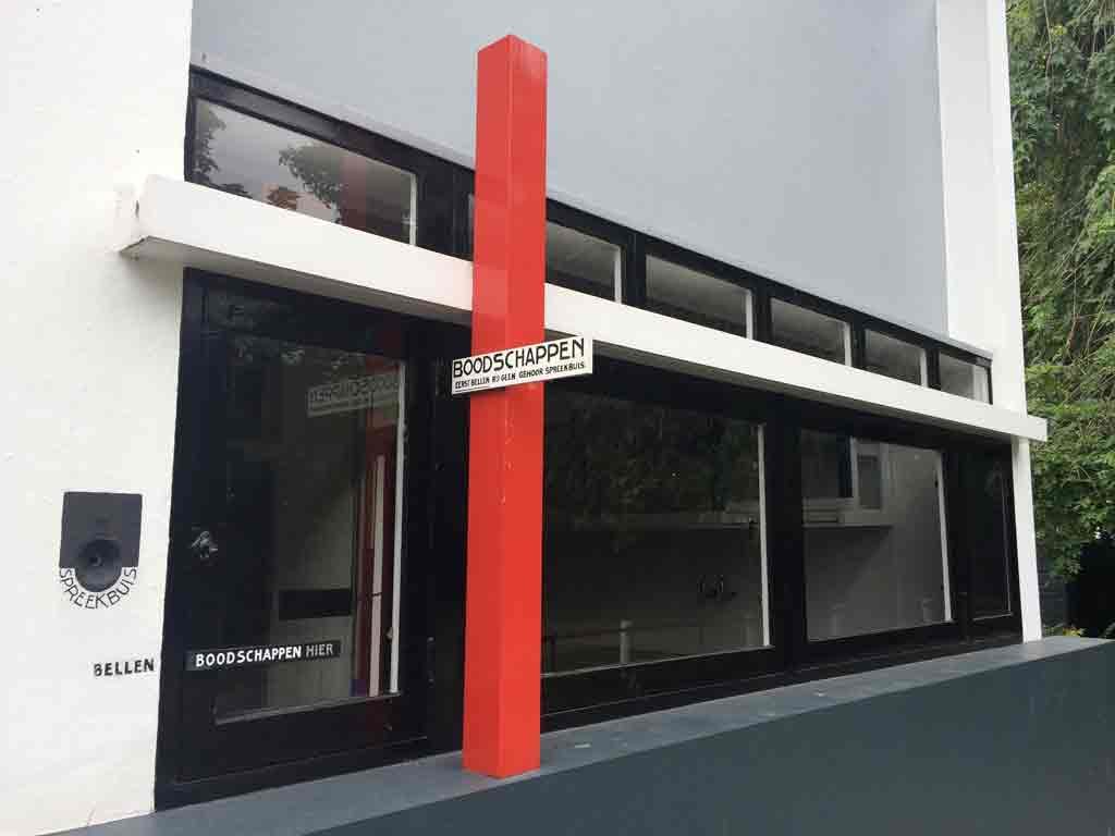
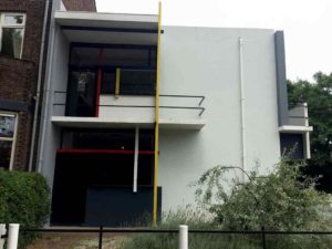
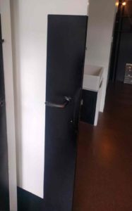
Even before we entered, we saw a few clever details. There was a mail slot in a glass box, so you could see if you had received mail. There was a hatch for deliveries and instructions painted on the exterior indicating to delivery men to talk into a hole in the wall. And while the building was a combination of rectangles in the De Stijl colors — red/yellow/blue/white/black and grey, the front door, was black, so as not to show dirt. All of the doors in the house were either black or had black rectangles around the handles, for the same reason.
The house was built as a commission by the widow Truus Schröder-Schräder, and Schröder is given credit for designing the house with Rietveld. She had some very Dutch ideas about having a clean simple life. She had the house built with a sink in every room, and colored paint was the only decorative element. In some ways this reminded me of the Beeldenstorm, when in the 16th century Dutch Protestant mobs removed all Catholic decorations from churches, which were stripped bare and white-washed. But while quintessentially Dutch in some ways, Schröder and Rietveld rejected conventionality, both in the design of the house, which shocked the neighbors, and in the love affair they started as they built the house. Reitveld designed an office for himself on the ground floor but he did not move into the house to live with Schröder until his wife died 30 years later.
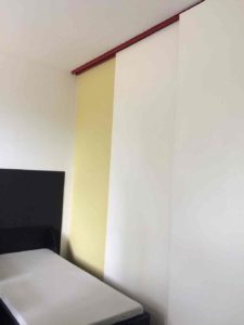
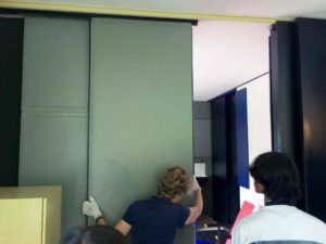
More than colored rectangles, the house is a study in light and space. This was especially clear when we moved to the upstairs, where Schröder and her children lived — while the kitchen, Rietveld’s office and a maid’s bedroom were downstairs, the Schröders’s bedrooms and the living and dining areas are all upstairs. When I first climbed the stairs, the second was almost all one big open space. The only walls were around the toilet, and between the dining area and Truus Schröder’s bedroom (this wall includes a dumb waiter to bring food up from downstairs). But then the guide put on white gloves, and started to demonstrate the magic of the house. Colored panels (in the De Stijl colors) slid out, closing off the bedrooms. Colored rectangles, hanging on the walls fit into the window frames as shutters. Even the central stairway and the sky light could be closed up at night.
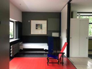
Son’s bedroom. Note the rectangular shutter hanging on the wall, and the red rectangle painted in the floor.
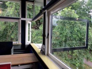
And these weren’t the only magic transformations – tables folded out from the walls, beds converted into couches, and stools into chairs. One of the most beautiful “tricks” was one I had seen Frank Lloyd Right use — because the house’s walls are not load-bearing, and the supports are not in the corners of the house, the corner windows in the dining area are able to open without any frame between them, making it almost feel like you are outside.
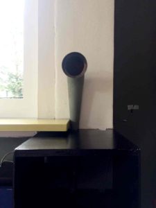
Another cleaver device was the speaking tube or “spreekbuis”, which acted almost like an intercom. It allowed vendors like the milkman to speak the residents.
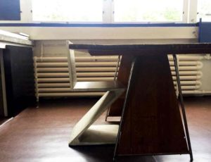
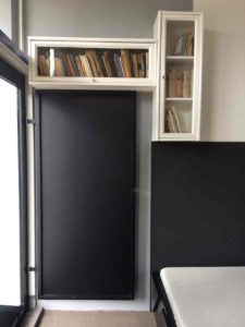
Much of the house’s design seems a bit less radical to us, who are accustomed to a century of stripped down design — it can even feel a bit like Ikea. While most of the interior was custom made, including even the radiators, I was amused to hear that the bookshelves mounted on one wall were, in fact, from Sears. Schröder had mounted one horizontally and one vertically, in keeping with the theme of irregular rectangles.
The house was so exciting to visit, I was almost sorry to go when the tour was over.
© 2026 50Museums.eu | Theme by Eleven Themes

Leave a Comment