
50 European Museums in 50 weeks
Museo do Design e Da Moda, Lisbon | Graphic City
January 8, 2017
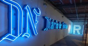
 MUDE, the design museum was closed for renovation when we were in Lisbon, but they had an amazing temporary exhibit in a temporary space. The exhibit was of 80 different 20th Century commercial signs from Lisbon that have been saved after they were taken down from their original location. The signs were stunning as objects, and they took on a different feeling taken out of their context on the street and moved inside on the walls of a gallery.
The exhibit included these signs, as well as photos of the signs in place over the businesses they had advertised, as well as drawings and plans from the permit applications the sign designers had created for these same signs.
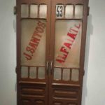
- Painted sign on a door
- Painted metal signs
- Cut metal signs
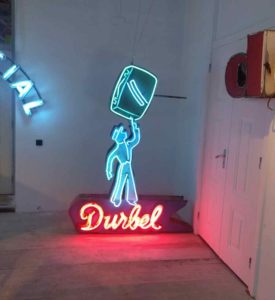
The exhibit starts out with painted signs and cut metal signs before moving onto the neon signage that were the highlight of the show.
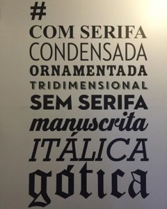
One amusing feature was that, since the exhibit was designed by (and for) graphic designers, visitors were encouraged to post pictures with hashtags based on the font style used on the sign (#italica, #sem serif, #tridimentional). This is in contrast to the Neon Museum in Las Vegas, which emphasizes the kitsch side of their signage.
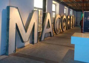
The final room of the exhibit concentrated on the huge signs that used to be on the tall buildings ring the central squares in Lisbon, in a sort of Times Square style. These were all removed by city edict, during a period when the city was in decline. The scale of these signs was very impressive, viewed up close in the gallery – each letter was larger than a person.
I liked this exhibit because it worked on so many levels. I felt the nostalgia for the different historical periods represented, I felt the graphical power of these signs, and, put into a gallery space, they seemed to become art objects, almost like ready-made versions of pop-art or of Dan Flavin’s florescent art.
© 2026 50Museums.eu | Theme by Eleven Themes



Leave a Comment