50 European Museums in 50 weeks
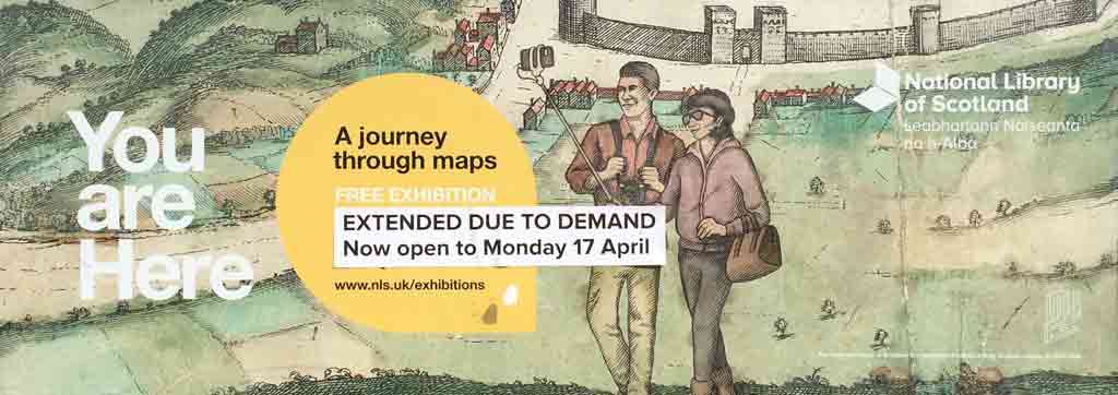
National Library of Scotland | You are Here
March 28, 2017
 This wonderful exhibit demonstrates how a small, thoughtfully crafted show can be as engaging and educational as a huge blockbuster, such as Drawing the Line at the British Library last winter. While the British Library show was cool in its own way — it seemed to include every interesting modern map in the British Library’s expansive collection — this small exhibit in a smaller library is very focused. Each of the five galleries makes one or two points, using a less than a dozen maps.
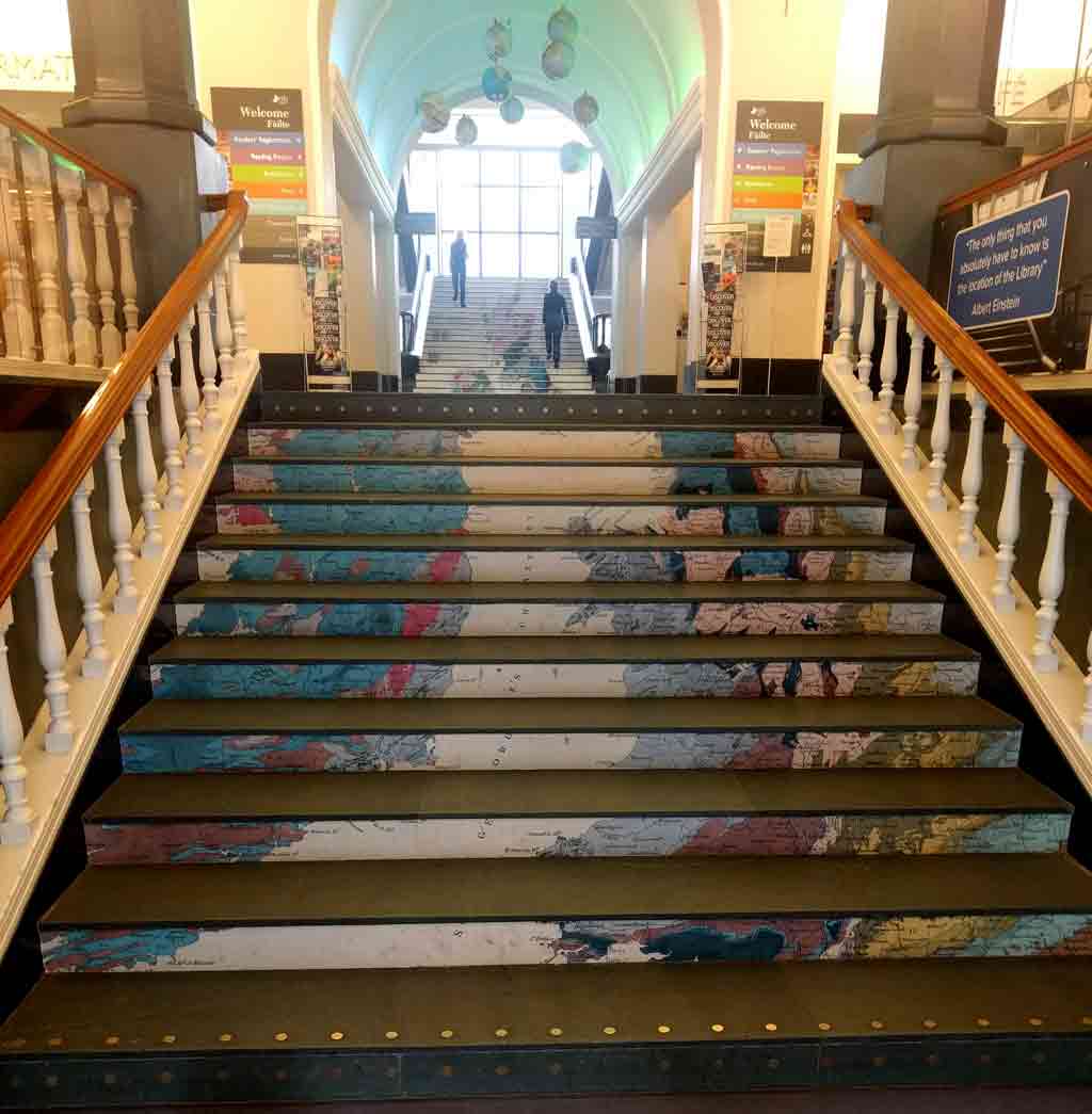
Promotion for the exhibit on the stairs of the library
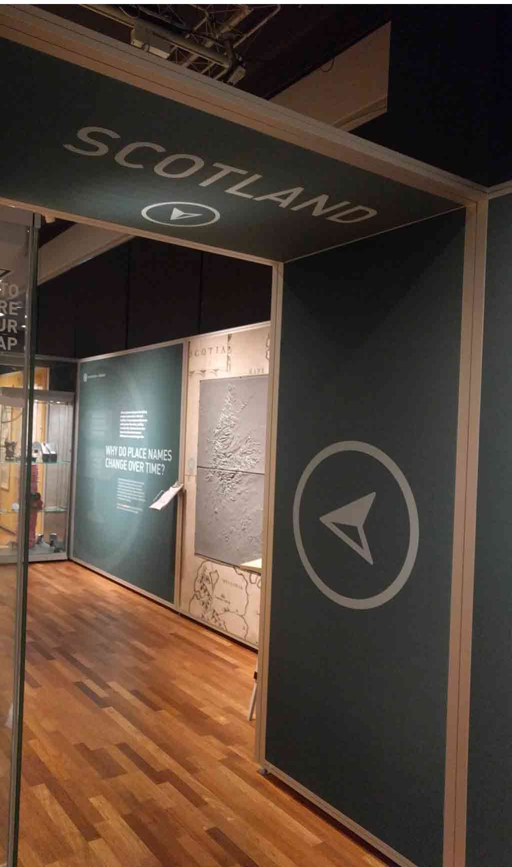
On to Scotland
The first thing I liked about this exhibit was the overarching theme, as demonstrated by the show’s title You are Here. The exhibit literally starts with where you are, with plans of the library and maps of Edinburgh, and zooms out with a gallery of maps of Scotland, followed by maps of Great Britain, Europe, and finally the entire world.
Topological map of Scotland
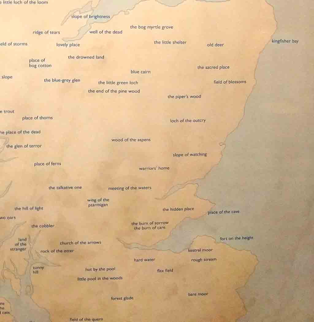
Detail of map replacing place name with their original meaning
Each room concentrated on a different challenge for map makers. For instance, in the Scotland Gallery, the exhibit showed different approaches to representing the topology — the mountains, highlands and lowlands of Scotland. Some maps simply indicate altitude with lines and numbers, others with colors or with shades of grey (since many maps were printed in black). At the same time, the show also highlighted some unique maps of Scotland, such as an old map of Scotland in Arabic, and a lyrical map where the place names were replaced by the original meaning of the name.
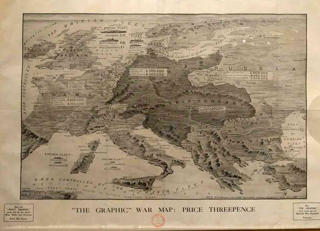
“Graphic” war map. Published in “The Graphic” in 1914
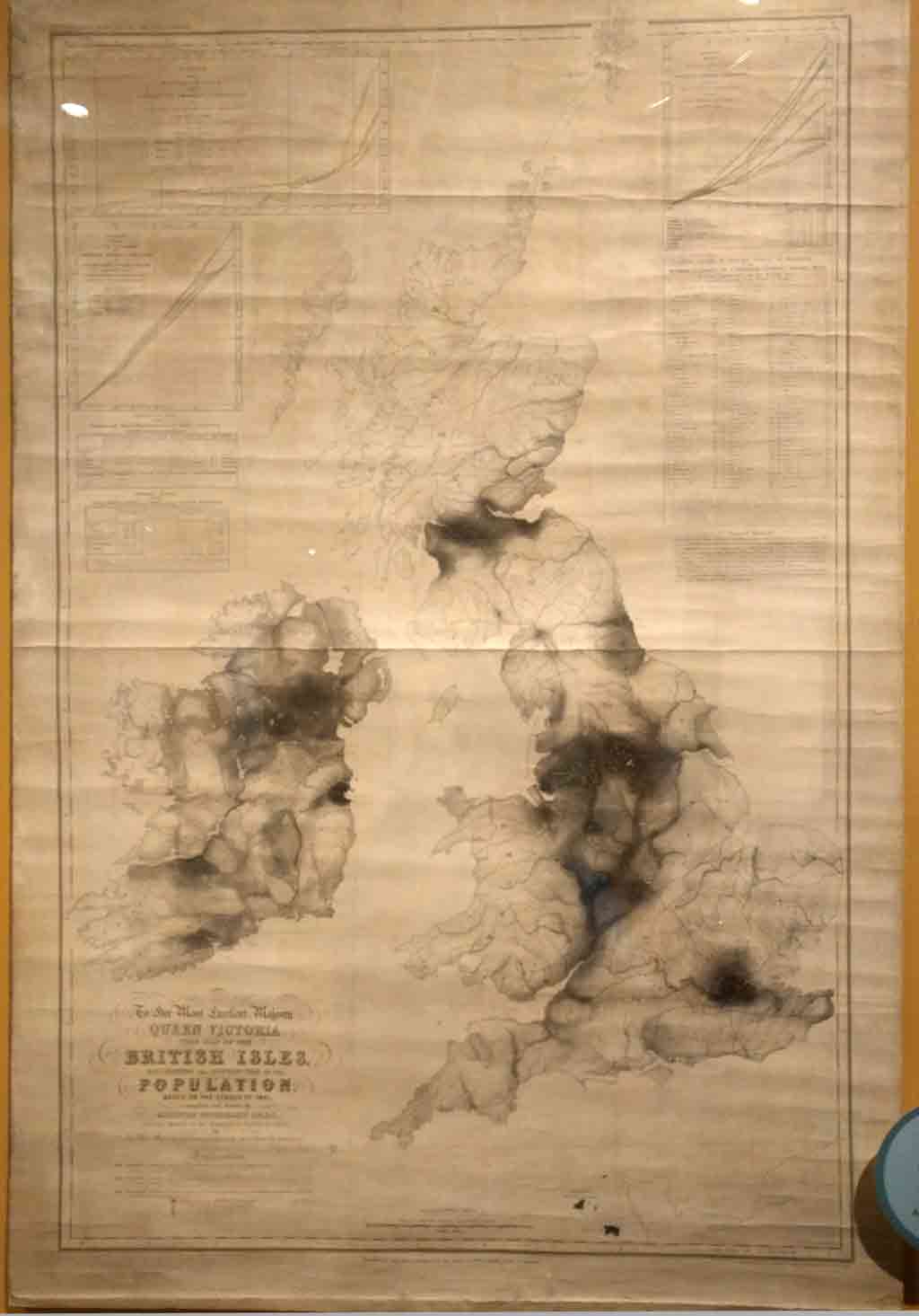
The maps of Europe addressed the question “Do maps go out of date?” by showing how old maps can tell us our history. One map from the late 19th Century shows the national borders at that time, including the Austrian and Prussian Empires. The “Graphic” war map, published during World War I showed warships, fortresses, and the number of men in different battles. This map, published by a weekly newspaper, is giving news in map form.
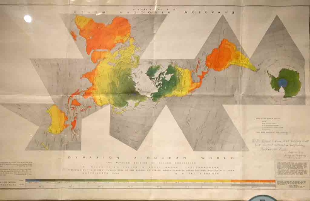
Buckminster Fuller’s “Dymaxion Globe”, which can be cut out and turned into a globe.
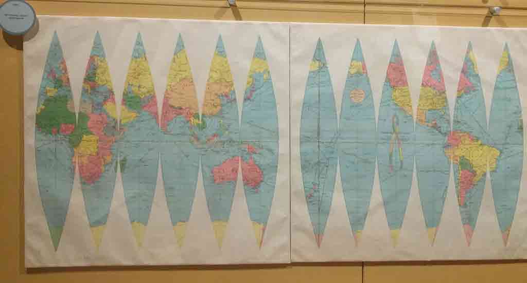
1960’s world map the accurately represents land masses.
The final gallery with maps of the world highlights the challenges of projecting the map of a spherical object onto a flat map. A number of different projections are displayed, including some which challenged the implied political message of traditional maps that put Wester Europe and North America at the top in the center, and which represent them larger than some other parts of the world. Other maps, designed for airplane pilots, need a different kind of accuracy than the nautical maps of previous centuries, emphasizing the North and South poles, which are often the shortest distances for long flights. Unusually shaped maps, such as Buckminster Fuller’s Dymaxion map are more accurate, but are challenging to read than simple rectangular maps.
Other themes touched on in the exhibit are “How Does the Cartographer Choose What to Exhibit?”, “Why Use Symbols?” and “How do Maps Show Human Activity?” Each theme is addressed in a way that engages both school children and adult visitors.

Different ways for travelers to carry maps over the centuries
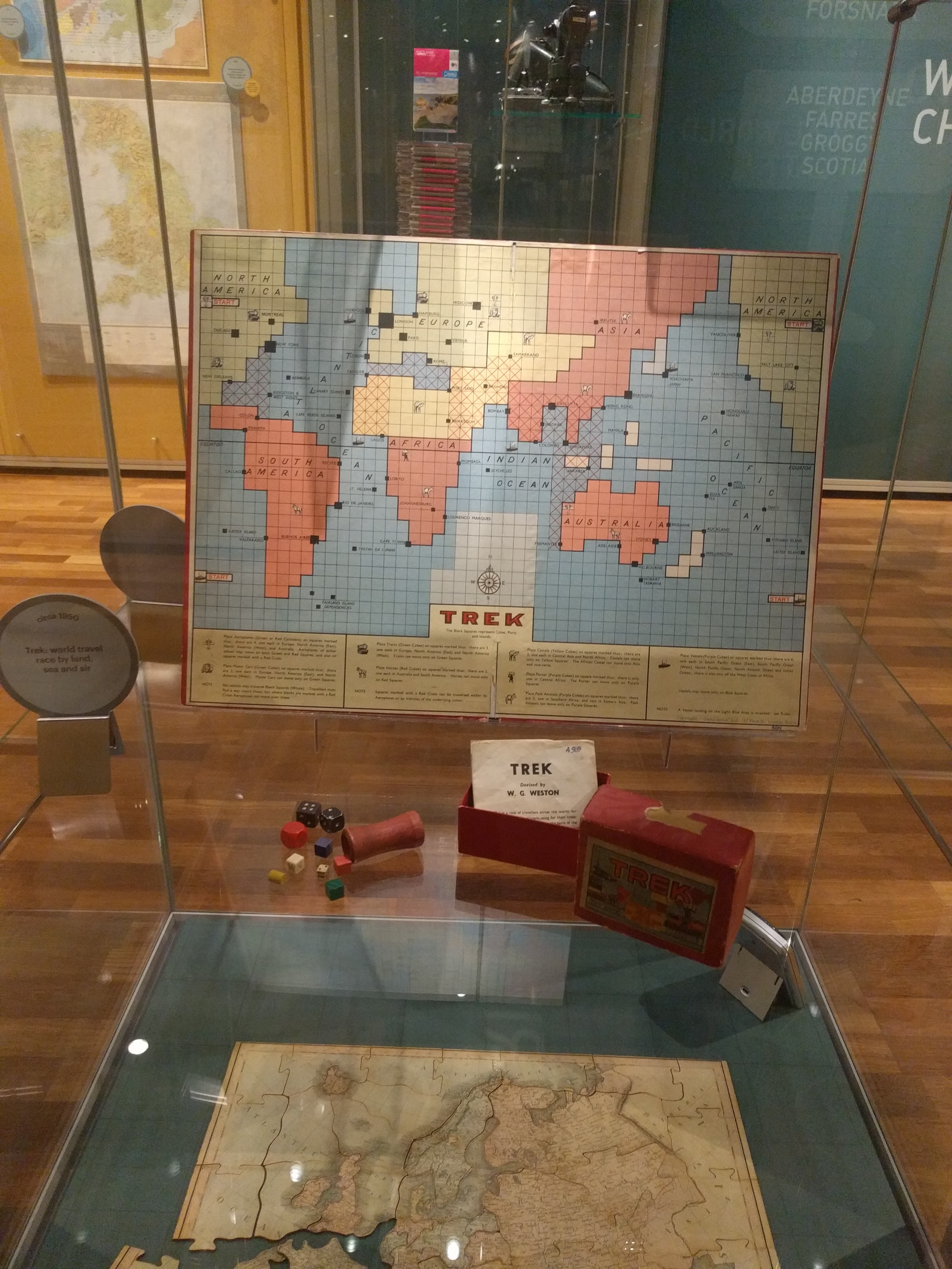
Map based games and puzzles
In between the other galleries there were two intriguing display cases that did not fit into the main organization of the show. One showed how travelers in different times have made maps usable while traveling. While we are familiar with today’s smartphone maps and GPS devices, the exhibit showed a box with a scroll, allowing the traveler to only reveal the currently relevant part of the map. Another intriguing device allowed the user to flip between maps by pulling on a lever — these maps were cut into strips to make this device work. The other case showed toys and games based on maps. These were interesting as artifacts and also graphically, as they had to change the maps to fit the needs of the game.
When I visited the British Library’s exhibition, I was overwhelmed — in a good way — and couldn’t imagine a map show that would top that. But this exhibit, by concentrating on a few important ideas and executing them very well, was every bit as interesting.
© 2026 50Museums.eu | Theme by Eleven Themes
Leave a Comment